A welcoming home isn’t created by accident—it emerges from thoughtful design decisions that address how we experience space on physical, emotional, and sensory levels. When you cross the threshold into a truly inviting interior, you feel it immediately: muscles relax, breathing deepens, and an involuntary sense of comfort settles over you. This response happens because skilled design speaks directly to our innate human needs for safety, connection, and ease.
Design Secrets for Homes That Feel Instantly Welcoming
Over years of working in interior architecture, I’ve observed that the homes people find most magnetic share specific design principles. These aren’t about budget or square footage—they’re about understanding how spatial relationships, sensory experiences, and thoughtful details combine to create environments that genuinely welcome both inhabitants and guests.
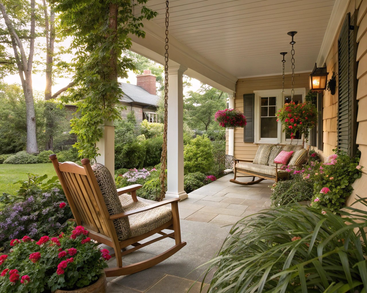
The approach to your home establishes emotional tone before anyone steps inside. The path from street to door creates what I call the “arrival sequence”—a gradual transition from public to private space that allows guests to mentally prepare for entry.
Consider your front entrance through fresh eyes. Does the pathway feel clear and intentional, or does it peter out into confusion? Well-defined walkways using brick, stone pavers, or stamped concrete create visual clarity and physical ease. A gently curved path feels more relaxed and encourages a slower, more mindful approach, while straight geometric paths project formality and structure.
Outdoor Entry Elements That Signal Welcome:
| Element | Function | Design Consideration |
|---|---|---|
| Pathway lighting | Safety and guidance | Use warm-toned fixtures (2700K-3000K) at 18-24 inch intervals |
| Seating | Invitation to linger | Position chairs or bench visible from street |
| Greenery | Life and seasonal interest | Flank door with substantial planters; choose hardy, season-appropriate plants |
| Door color | Visual anchor and personality | Select bold or meaningful hue that contrasts architecture |
| Entry mat | Physical and symbolic threshold | Choose substantial size (minimum 3×5 feet) with texture |
The front door itself serves as the focal point of your home’s exterior identity. A freshly painted door in a distinctive color—navy, forest green, or warm terracotta—immediately elevates curb appeal and signals that care has been invested in the home. Hardware matters too: aged brass, oil-rubbed bronze, or matte black finishes add tactile quality and visual weight.
I’ve seen dramatic transformations when homeowners upgrade entry lighting. Rather than a single harsh overhead fixture, layer your exterior lighting with wall sconces flanking the door plus pathway illumination. This creates depth, eliminates harsh shadows, and makes guests feel they’re approaching a well-tended sanctuary rather than simply a building.
Mastering the Threshold: Interior Entries That Embrace
The interior entryway presents unique design challenges—it must be functional, beautiful, and establish the home’s design language in a compressed space. Whether you have a dedicated foyer or a simple door that opens directly into living space, several principles apply universally.
Create Immediate Visual Clarity
Sightlines—the uninterrupted views from one point to another—profoundly influence how welcoming a space feels. From your entry, what does a guest see first? Ideally, their eye should land on something beautiful: a piece of art, a window with garden views, architectural detail, or a carefully styled console.
Avoid the common mistake of allowing entry sightlines to lead directly into private spaces or visual clutter. If your front door opens with a direct view into bedrooms, bathroom, or kitchen mess, consider strategic interventions: a decorative screen, a repositioned bookcase, or even a ceiling-hung plant can redirect the eye without blocking flow.
Functional Layers That Eliminate Chaos
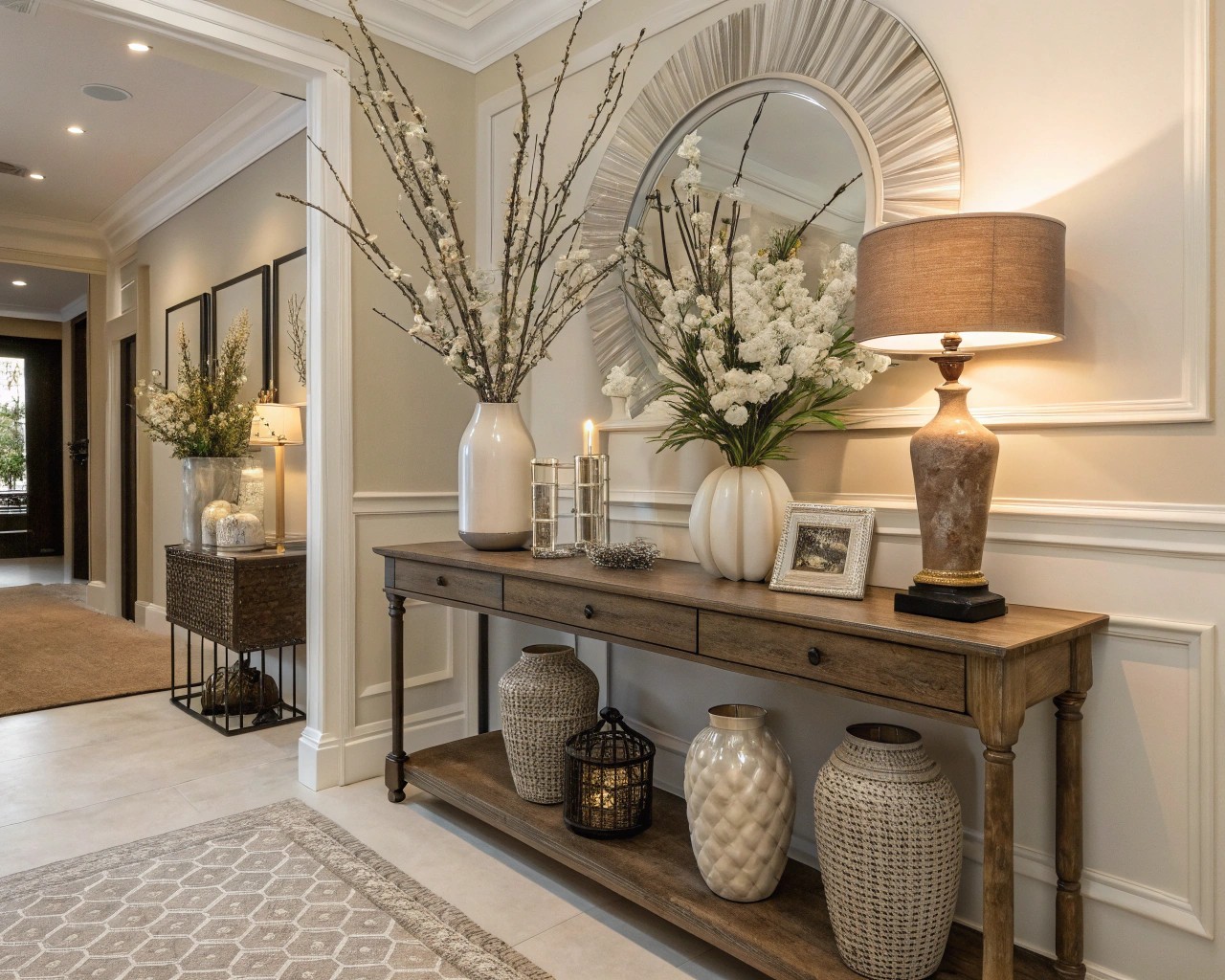
The most welcoming entries balance beauty with practical storage. In regions with variable weather—which describes most of America—you need space for the realities of daily life: shoes, coats, bags, umbrellas, keys.
Essential Entry Functions:
- Seating: A bench or pair of chairs allows comfortable shoe removal without awkward balancing
- Surface: Console table or narrow shelf for key bowl, mail sorting, decorative objects
- Storage: Hooks, coat closet, or decorative baskets keep clutter contained
- Mirror: Provides last-minute appearance check and reflects light to expand space
- Lighting: Layer ambient, task, and accent lighting to create welcoming glow
I recommend providing what I call “landing zones”—designated spots where daily items naturally accumulate. A shallow bowl for keys, wall hooks at varying heights for family members, and a basket for dog leashes prevent the entry from becoming chaotic. When these functional elements have visual appeal—a hand-thrown ceramic bowl, vintage brass hooks, a woven basket—they enhance rather than detract from aesthetics.
Sensory Welcome: The First Moments Inside
The moment someone enters your home, multiple senses engage simultaneously. Temperature, lighting quality, sound, and scent all contribute to immediate impression.
Temperature regulation matters more than many realize. An entry that feels noticeably colder or warmer than outdoor temperature creates discomfort. If your entry lacks climate control, consider adding a discrete heat source or improving insulation.
Lighting warmth proves critical. Harsh, cool-toned overhead lights (above 4000K) create an institutional feeling. Instead, use warm bulbs (2700K-3000K) in layered fixtures—overhead plus table lamp or wall sconces—to create inviting ambient light. Install dimmer switches to adjust intensity throughout the day.
Acoustic quality shapes emotional response. Hard surfaces—tile floors, bare walls—create echo that feels cold. Soften entry acoustics with a substantial rug, upholstered bench, or even a textile wall hanging. These absorb sound and immediately make the space feel warmer.
Scent connects directly to emotion and memory through the brain’s limbic system. A welcoming home has a pleasant, subtle fragrance—never overwhelming. Natural options include a diffuser with essential oils (lavender for calm, citrus for energy, vanilla for comfort), fresh flowers, or a high-quality candle. I avoid synthetic air fresheners, which can read as masking unpleasant odors rather than genuinely enhancing atmosphere.
Light as the Foundation of Welcome
After decades working with space, I’m convinced that lighting may be the single most powerful—and most frequently mishandled—element in creating welcoming interiors.
The Three-Layer Lighting Strategy
Professional lighting design employs three distinct layers that work together to create depth, eliminate harsh shadows, and support various activities:
Ambient lighting provides overall illumination—the base layer that allows safe navigation and general visibility. This typically comes from ceiling fixtures, recessed lights, or natural windows. The key mistake is relying exclusively on ambient lighting, which creates flat, uninviting spaces.
Task lighting supports specific activities: reading lamps, under-cabinet kitchen lights, desk lamps, vanity lighting. This layer should be adjustable and positioned to eliminate shadows on work surfaces.
Accent lighting creates visual interest by highlighting architectural features, artwork, or decorative objects. Picture lights, track lighting, or strategically placed uplights add drama and draw attention to beautiful elements.
I’ve transformed countless homes simply by removing harsh overhead fixtures and replacing them with multiple, lower-wattage lamps distributed throughout rooms. This creates what designers call “pools of light”—varied intensities that add depth and allow people to gravitate toward lit areas that feel cozy and defined.
Color Temperature and Emotional Tone
The color temperature of light—measured in Kelvin—dramatically affects how welcoming a space feels. This is technical knowledge with visceral impact.
Warm light (2700K-3000K) emits yellowish tones that feel relaxed, intimate, and residential. Use this temperature in living rooms, bedrooms, dining areas, and entries—anywhere you want people to feel comfortable lingering.
Neutral light (3500K-4000K) provides balanced illumination without strong color cast. This works well in transitional spaces like hallways or multipurpose rooms.
Cool light (5000K+) creates bluish-white illumination that feels energizing but potentially clinical. Reserve this for task-specific areas like workshops, garages, or laundry rooms—spaces where you want alertness rather than relaxation.
The most common mistake I encounter is mixing color temperatures randomly throughout a home, which creates jarring transitions. I maintain consistent warm temperature (2700K-3000K) throughout main living areas, allowing the home to feel cohesive as you move from room to room.
Creating Conversation and Connection Through Furniture Arrangement
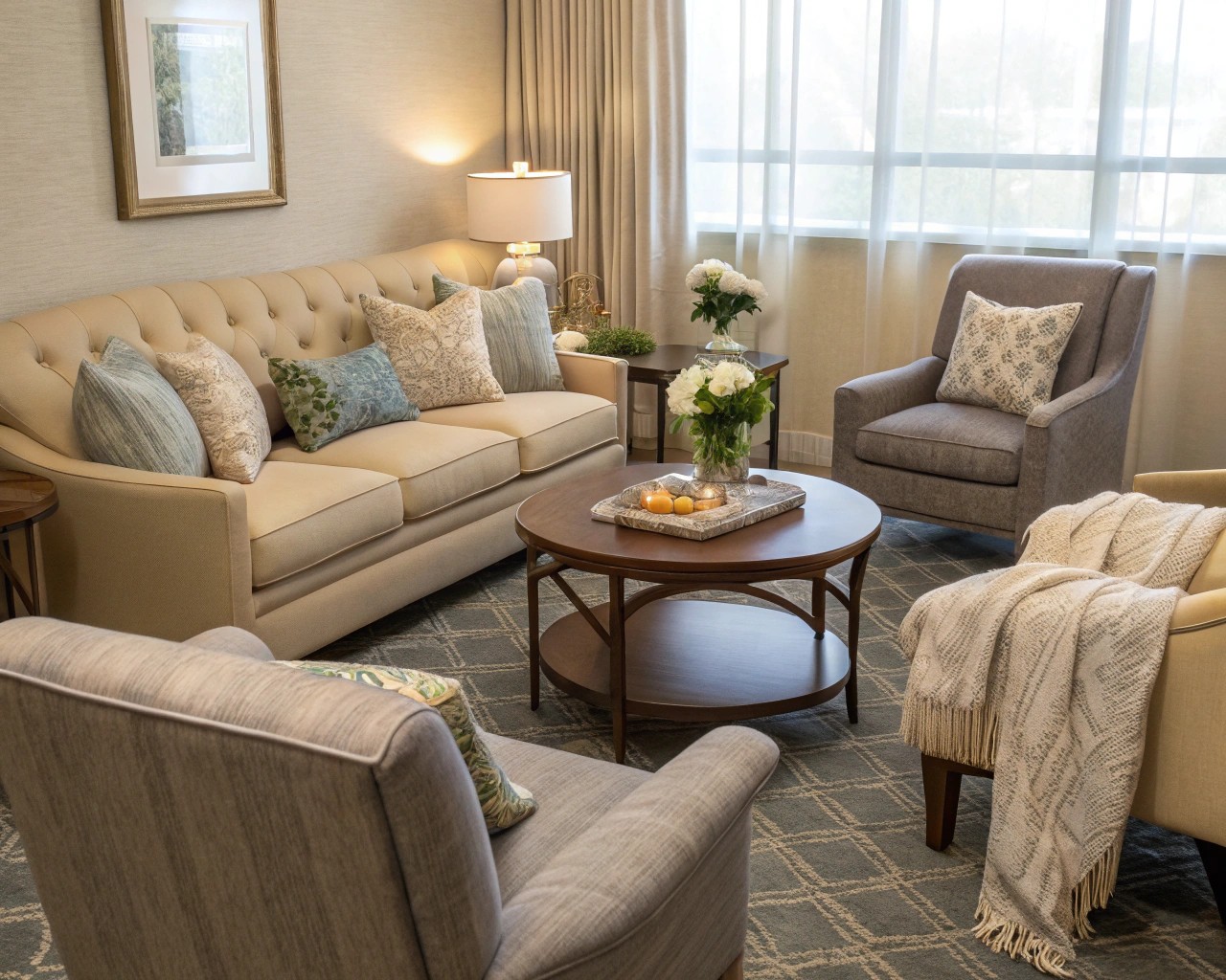
The most welcoming homes facilitate easy human interaction through thoughtful furniture placement. I’ve entered countless beautiful homes where conversation felt oddly difficult—people perched uncomfortably, angled awkwardly, or seated too far apart to speak naturally. This happens when furniture arrangement prioritizes other concerns (views, television, traffic flow) over human connection.
The Conversational Circle
The fundamental principle involves arranging seating in a roughly circular or U-shaped configuration that allows people to make easy eye contact without craning their necks. The optimal distance between speakers is 8-10 feet—close enough for comfortable conversation without feeling crowded.
The classic “two-to-one ratio” works beautifully in most living rooms: one substantial sofa paired with two chairs creates natural conversational geometry. The chairs can flank the sofa or face it, depending on room dimensions. This arrangement feels balanced, provides ample seating, and naturally encourages dialogue.
Conversational Seating Guidelines:
- Position largest piece (sofa) to face room’s focal point (fireplace, window view, architectural feature)
- Add accent chairs to complete the circle—flanking or facing sofa
- Maintain 8-10 feet between facing seats for comfortable conversation distance
- Keep 18-24 inches clearance between furniture and coffee table for easy passage
- Arrange furniture to create intimate groupings rather than lining walls
Coffee tables or ottomans should sit at comfortable height (typically 16-18 inches) and position within easy reach of all seating. Round or oval tables encourage better flow in smaller spaces, while rectangular tables work well in larger, more formal rooms.
I’ve found that moving television away from the central focal point—or eliminating it entirely from primary entertaining spaces—dramatically increases how welcoming a room feels. When screens dominate, human faces become peripheral. The most inviting homes I’ve designed include dedicated media rooms while keeping main living areas focused on face-to-face interaction.
The Transformative Power of Texture Layering
Visual appeal matters, but homes feel truly welcoming when they engage our tactile sense through varied, inviting textures. This is where design moves from merely looking good to feeling genuinely comfortable.
Building Your Textural Palette
Think of texture as creating visual and tactile interest through contrast. Smooth leather against nubby linen. Sleek wood surfaces paired with soft wool. Cool metal accents warming against velvet cushions.
Foundation textures establish your base: flooring (hardwood, tile, concrete), wall treatments, and large furniture pieces. These typically feature harder, more durable surfaces.
Layering textures add warmth and invitation: area rugs over hard floors, upholstered furniture, window treatments, throw pillows, and blankets.
Accent textures provide finishing touches: woven baskets, carved wood objects, ceramic vessels, metallic accessories.
I start with a substantial area rug to define the seating area and immediately soften acoustic and visual harshness. Choose rugs large enough that front legs of major furniture pieces rest on the rug—this anchors the arrangement and makes the space feel cohesive.
Layer textiles generously: throw blankets draped over sofa arms, varied pillow combinations in complementary fabrics (linen, velvet, cotton, wool), and window treatments that puddle slightly at the floor for luxury. The key is creating abundance without clutter—textures should feel deliberately chosen rather than randomly accumulated.
Material Warmth and Natural Elements
Hard, smooth surfaces—glass, polished stone, metal—project sophistication but can feel cold without softening elements. The most welcoming homes balance these with warmer materials.
Wood tones immediately add warmth. Whether in flooring, furniture, or decorative objects, wood’s natural grain and inherent imperfection creates human-scale comfort. I favor visible wood grain over heavily lacquered finishes—the texture invites touch and feels more approachable.
Natural fiber textiles—cotton, linen, wool, jute—breathe and age beautifully while feeling comfortable against skin. Synthetic materials have their place, but natural fibers convey quality and create more inviting tactile experiences.
Incorporating live plants adds another texture layer while introducing biophilic elements that inherently comfort us. The visual texture of foliage softens architectural lines, while the subtle movement of leaves adds life to static spaces. Even in low-light conditions, certain varieties (pothos, snake plants, ZZ plants) thrive and contribute organic warmth.
Biophilic Design: Connecting to Nature’s Comfort
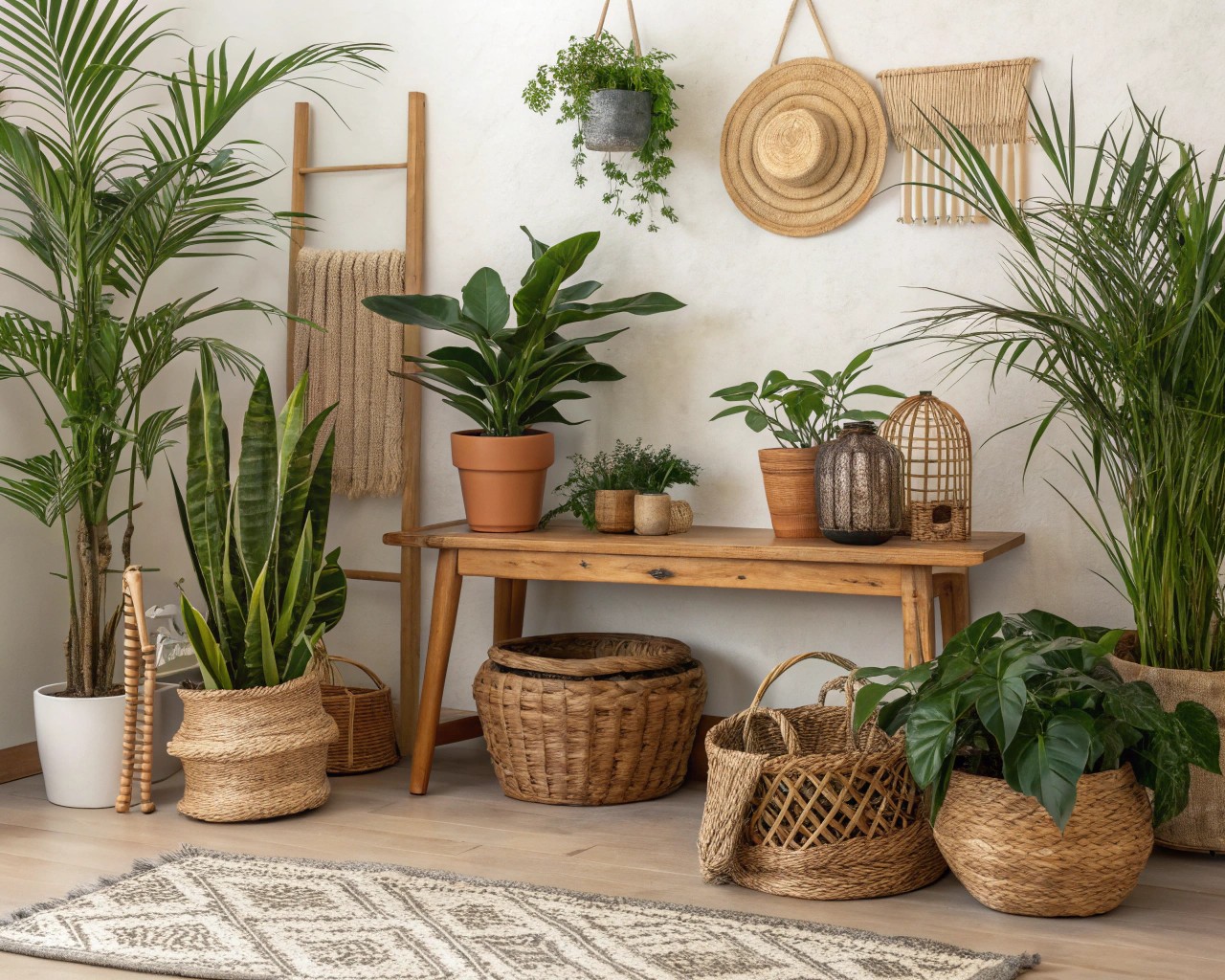
Humans possess innate affinity for natural elements—a biological inheritance from our evolutionary history spending millennia immersed in natural environments. This connection, called biophilia, remains relevant even in contemporary homes far removed from wilderness. Incorporating natural elements isn’t merely aesthetic—it’s addressing fundamental human need.
Direct Nature Connection
The most obvious biophilic intervention involves introducing living plants throughout your home. Beyond their oxygen-producing benefits, plants provide visual interest, soften hard edges, and create sense of vitality.
Position plants strategically: tall specimens in room corners draw eyes upward and activate underused space, while trailing varieties on shelves create visual movement. Cluster smaller plants in groups of three or five for impact rather than scattering single specimens throughout.
Natural materials—stone, wood, clay, natural fibers—create tangible connection to earth elements. A limestone or slate tile entry, timber beams, ceramic vessels, or woven baskets all reference natural world in ways that comfort us on subconscious level.
Indirect Nature Connection
When direct nature incorporation isn’t feasible, indirect references still provide biophilic benefits. Nature-inspired artwork—landscapes, botanical prints, wildlife photography—triggers similar positive responses as actual nature.
Natural color palettes drawn from earth, sky, and foliage create calm. Soft greens, warm browns, sand tones, dusty blues, and terracotta all reference outdoor environments and feel inherently restful.
Water features—even small tabletop fountains—introduce soothing sound that masks ambient noise while evoking natural environments. The gentle sound of flowing water measurably reduces stress responses and creates meditative atmosphere.
Light and Nature
Natural light profoundly impacts how welcoming interiors feel. Maximize daylight penetration by removing heavy window treatments during day, positioning mirrors to reflect light deeper into rooms, and keeping window sightlines unobstructed.
The quality of natural light changes throughout day, creating dynamic environmental shifts our bodies evolved to respond to. North-facing light remains relatively constant and cool, while south-facing exposure provides warm, changing light. East windows deliver morning brightness, west windows afternoon warmth. Understanding your home’s light exposure helps you select appropriate color palettes and position activities (reading nooks in bright areas, restful spaces in softer light).
The Spatial Experience: Scale, Proportion, and Flow
Beyond specific design elements, the overall spatial experience determines whether a home feels welcoming or alienating. This involves understanding human scale—proportions and dimensions that feel comfortable and appropriate to our physical bodies.
Human-Scale Architecture
Monumental spaces with soaring ceilings and vast dimensions can impress but often fail to comfort. We feel most at ease in spaces that reflect human proportions—ceiling heights we can visually comprehend, rooms where we can see boundaries, doorways scaled to our bodies.
Standard residential ceiling heights (8-9 feet) feel comfortable because they create enclosure without oppression. Higher ceilings work well in specific applications—formal entries that should feel grand, great rooms designed for gatherings—but shouldn’t characterize entire homes.
Room dimensions matter too. Rooms that are too large for their function feel empty and uncomfortable; rooms too small create claustrophobia. I aim for proportions where furniture and people fill the space appropriately—not crowded, not lost.
Human-Scale Design Elements:
- Ceilings at 8-10 feet for intimate spaces; up to 12-14 feet for gathering areas
- Doorways at 6’8″ to 7′ height—proportional without feeling miniature
- Windows sized and positioned to provide views while seated
- Built-in seating (window seats, banquettes) that accommodate average human dimensions
- Architectural details (moldings, paneling) at heights that relate to human body
Creating Flow and Intuitive Movement
The most welcoming homes feel easy to navigate—circulation paths seem obvious, destinations feel accessible, and movement through space flows naturally.
This starts with furniture arrangement that creates clear pathways rather than obstacle courses. Maintain at least 36 inches for primary circulation paths and 24 inches minimum for secondary routes. Avoid positioning furniture that forces awkward diagonal paths or requires people to sidestep constantly.
Open floor plans can enhance flow but require careful zoning to prevent cavernous, undefined spaces. Use furniture groupings, area rugs, lighting zones, or subtle level changes to define areas without walls. This creates intimate sub-spaces within larger volumes—satisfying human need for both openness and enclosure.
The concept of “prospect and refuge” proves valuable here. This evolutionary principle suggests humans prefer environments offering both expansive views (prospect—allowing us to see potential threats) and protected spaces (refuge—where we feel secure). In home design, this translates to spaces with good views out while providing cozy, enclosed seating areas. Window seats, alcoves, high-backed chairs, and partially enclosed spaces all satisfy refuge instinct while maintaining visual connection to larger room.
Managing Sightlines for Cohesion
As you move through a welcoming home, rooms feel related rather than disconnected. This cohesion emerges from carefully considered sightlines—the views from one space into adjacent areas.
Stand in your main entry and observe what you see: does the color palette flow? Do architectural elements (trim color, flooring, ceiling details) relate? Does furniture style complement across visible spaces?
I use consistent color palettes that transition gradually rather than abruptly shift. This doesn’t mean painting everything identical—rather, select colors that harmonize. A warm gray in the entry might transition to warmer greige in the living room, then to soft taupe in the dining area—each distinct but related.
Maintain consistent floor materials or create thoughtful transitions. If changing from tile in entry to hardwood in living area, use a threshold that’s intentional—perhaps stone or metal strip—rather than abrupt change.
Color Psychology: Setting Emotional Tone
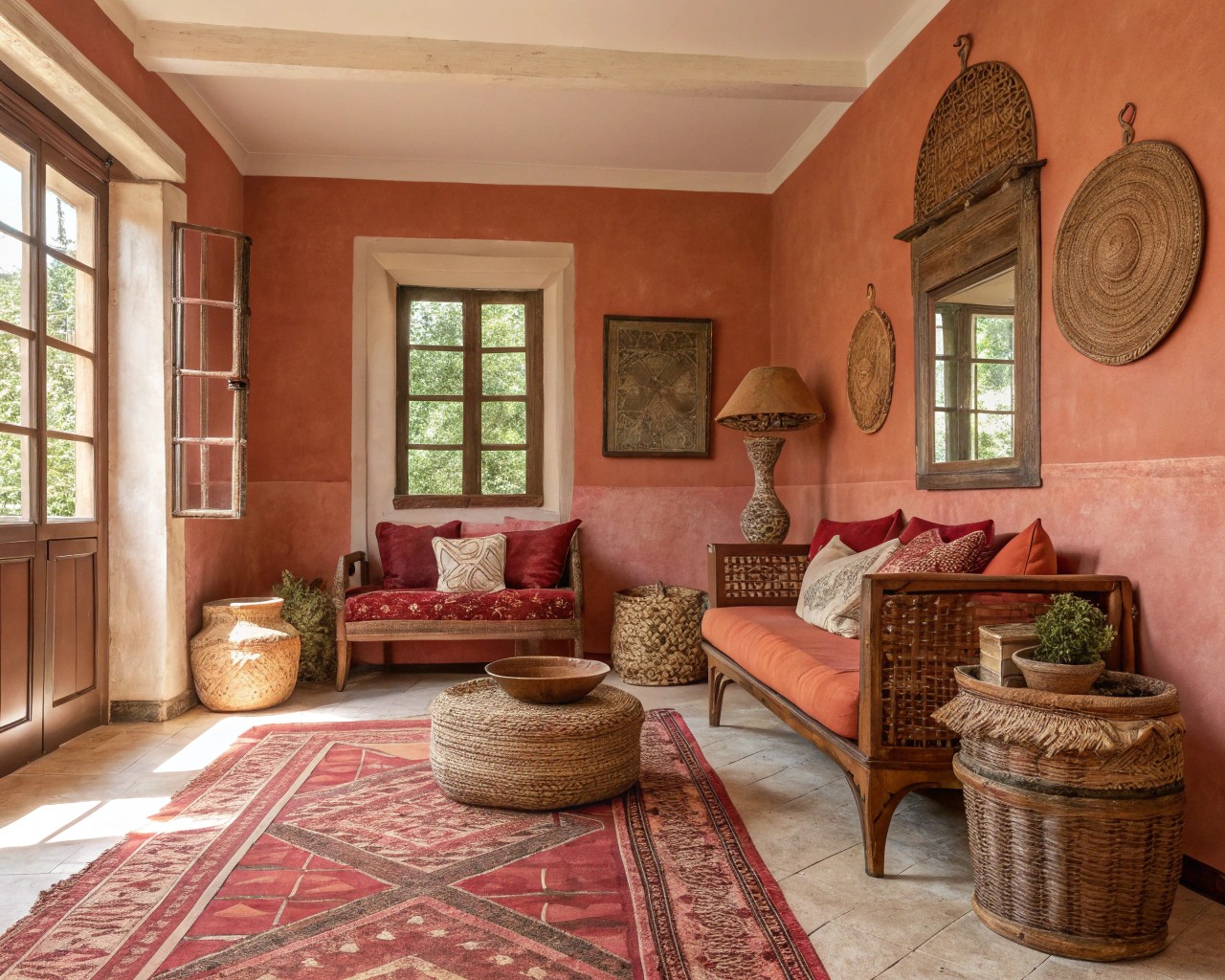
Color profoundly influences mood and how welcoming spaces feel. This isn’t merely preference—color psychology has measurable physiological and emotional effects.
The Warm Color Advantage
For spaces intended to welcome and comfort, warm color palettes consistently outperform cool ones. Warm tones—reds, oranges, yellows, and their muted derivatives (terracotta, peach, warm beige, golden tan)—create psychological warmth that translates to physical comfort.
These colors advance visually, making large rooms feel cozier and more intimate. They flatter skin tones in lamplight, creating the soft glow we associate with candlelit dinners and cozy evenings.
Specific warm colors create different effects:
Terracotta and rust ground spaces with earthy stability. These reference clay, soil, and desert landscapes—ancient materials that comfort us. Use in entries, living rooms, or anywhere you want warmth without excessive energy.
Warm beiges and taupes provide neutral sophistication while maintaining welcoming warmth. These serve as excellent base colors that allow accent colors and textures to shine.
Muted golds and ochres add richness without overwhelming. These work beautifully in dining rooms where you want elegant warmth.
Soft coral and peachy pinks feel nurturing and gentle. Consider these for bedrooms or intimate sitting areas.
Strategic Cool Tones
Cool colors—blues, greens, purples—create different psychological effects. They recede visually, making small spaces feel larger, and evoke calm and contemplation.
I use cool tones strategically rather than throughout: a soft sage in a powder room for spa-like tranquility, dusty blue in a bedroom for restful sleep, deeper teal as accent color against warm neutrals.
The key is ensuring cool colors have warm undertones. Compare paint chips carefully: blue-grays with slight warmth feel much more welcoming than stark, cold grays. Green with golden undertones feels earthy; green with blue undertones can feel institutional.
Neutral Sophistication
Well-chosen neutrals—warm whites, soft grays with beige undertones (often called “greige”), warm taupes—create sophisticated, timeless backdrops. These allow furniture, art, and personal collections to become focal points while maintaining visual calm.
The mistake I see involves selecting neutrals that are too cool (stark white, cold gray) which create institutional rather than residential feeling. Test paint colors in your actual space, observing them in morning, afternoon, and evening light before committing. Colors that appear neutral in store lighting often reveal unwanted blue or green undertones in home lighting.
Multifunctional Spaces That Adapt to Life
Contemporary homes increasingly need to serve multiple purposes: living rooms that accommodate work-from-home arrangements, dining areas that function as homework stations, guest rooms that serve daily as offices. The most welcoming homes accommodate these realities without feeling cluttered or confused.
Flexible Furniture Solutions
Multifunctional furniture allows spaces to transform without major rearrangement. Consider:
- Sofa beds or daybeds that transition guest rooms from office to bedroom
- Nesting tables that expand for entertaining then tuck away
- Storage ottomans serving as seating, footrests, and concealed storage
- Drop-leaf or extension dining tables that shrink for daily use, expand for gatherings
- Murphy beds that disappear to reclaim floor space
The key is selecting pieces that don’t broadcast their dual purpose—furniture should look intentional rather than obviously compromised.
Zoning Without Walls
Open-plan spaces require deliberate zoning to feel welcoming rather than cavernous. Create distinct areas using:
Area rugs that define specific zones (dining area, seating area, workspace)
Furniture arrangement that creates natural boundaries—bookcase as room divider, sofa back facing away from dining area
Lighting zones that allow different areas to be lit independently
Ceiling treatments—varying heights, exposed beams, different paint colors—that subtly define areas without walls
These subtle boundaries help spaces feel purposeful without the visual and acoustic separation that walls provide.
The Personal Touch: Making Welcome Authentic
The most technically perfect design feels cold without personal elements that reflect inhabitants’ lives, interests, and stories. This is where professional design principles meet authentic living.
Curated Personal Collections
Display items that have genuine meaning: family photographs in beautiful frames, artwork collected during travels, handmade ceramics from local artisans, books you’ve actually read. These tell your story and give guests conversation starting points.
The key is curation—editing rather than displaying everything. Group smaller items (a collection of vintage cameras, seashells from memorable beaches, pottery pieces) on one shelf or surface for impact rather than scattering throughout. This reads as intentional rather than cluttered.
I use the “rule of three” for decorative vignettes: group objects in odd numbers (three, five, seven) at varying heights for visual interest. Combine different textures and forms—perhaps a tall ceramic vase, medium-height stack of books, and small sculptural object—for balanced composition.
Hospitality Principles at Home
The hospitality design industry—hotels, resorts, restaurants—excels at making people feel welcome because business depends on it. We can adapt these principles for homes.
Anticipate needs: Provide what guests might want before they ask. Charging stations for phones, fresh water in guest rooms, clear places to set drinks, ambient lighting that doesn’t require fumbling for switches.
Create comfort zones: Offer variety in seating—some firm and upright for dining, others deeply cushioned for lounging. Provide adjustable lighting, temperature control where possible, and acoustic privacy.
Maintain cleanliness: Nothing undermines welcome like visible dirt or clutter. Clear surfaces of unnecessary items, ensure bathrooms are fresh, and keep entryways organized.
Offer sensory pleasure: Beautiful views, pleasant scents, comfortable temperatures, good lighting, and minimal jarring noise all contribute to unconscious comfort.
Show thoughtfulness: Fresh flowers, carefully selected books and magazines, quality hand soap, soft towels—small details signal care and elevate experience.
Psychological Safety and Comfort
Beyond physical comfort, truly welcoming homes create psychological safety—the feeling that you can relax, be yourself, and let down defenses.
This emerges from several design elements:
Clear wayfinding: Guests should intuitively understand how to navigate space without constant guidance. Clear sightlines to bathrooms, consistent lighting that indicates pathways, and logical furniture arrangement all reduce navigation anxiety.
Privacy options: Provide spaces where people can retreat—bathroom with secure lock, guest room with solid door, quiet nook for introvert recharge. The ability to temporarily withdraw enhances comfort in social situations.
Visual calm: Avoid overwhelming pattern, excessive contrast, or chaotic arrangements that create visual stress. Restful spaces allow eyes to settle, reducing cognitive load.
Control: When possible, give people control over their immediate environment—adjustable lighting, accessible temperature controls, flexible seating arrangements. Even small amounts of personal control increase comfort.
Acoustic Comfort: The Overlooked Dimension
Sound quality profoundly affects how welcoming spaces feel, yet acoustic design is frequently neglected in residential projects.
Managing Reverberation
Hard surfaces—tile, hardwood, glass, plaster—reflect sound, creating echo that feels cold and institutional. The most common acoustic mistake involves creating rooms dominated by reflective surfaces without sound-absorbing elements.
Layer acoustic-absorbing materials throughout:
- Substantial area rugs over hard floors, especially in large rooms
- Upholstered furniture with fabric rather than leather surfaces
- Window treatments—curtains or fabric shades rather than hard blinds
- Acoustic panels or textile wall hangings in particularly echoey spaces
- Books on shelves, which absorb surprising amounts of sound
These don’t require specialized acoustic products—ordinary soft furnishings serve this purpose effectively.
Controlling Noise Transmission
Sound traveling from adjacent spaces, outdoors, or mechanical systems creates stress and prevents relaxation.
Address noise transmission through:
- Solid-core doors that block sound better than hollow-core alternatives
- Window treatments that add sound-dampening layer against outdoor noise
- Strategic furniture placement positioning bookcases or upholstered pieces against walls shared with noisy areas
- Weatherstripping that reduces noise infiltration through gaps
HVAC systems, refrigerators, and other mechanical equipment can create constant low-level noise that increases ambient stress. When renovating or building, prioritize quiet-rated equipment. For existing noisy systems, improve surrounding acoustic absorption to minimize impact.

