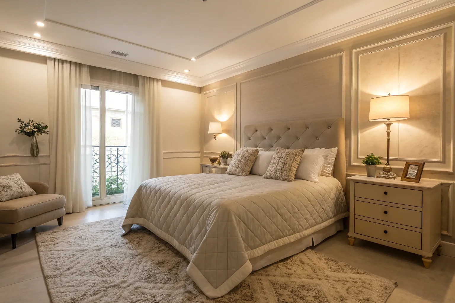
A well-chosen neutral palette transforms your home into a sanctuary where visual noise fades and genuine tranquility emerges. Over years of working with homeowners seeking calm, cohesive spaces, I’ve found that understanding the subtle architecture of neutrals—their undertones, their relationship with light, and their capacity for layering—makes all the difference between a room that feels flat and one that envelops you in quiet sophistication.
Understanding the Architecture of Neutral Color Palettes
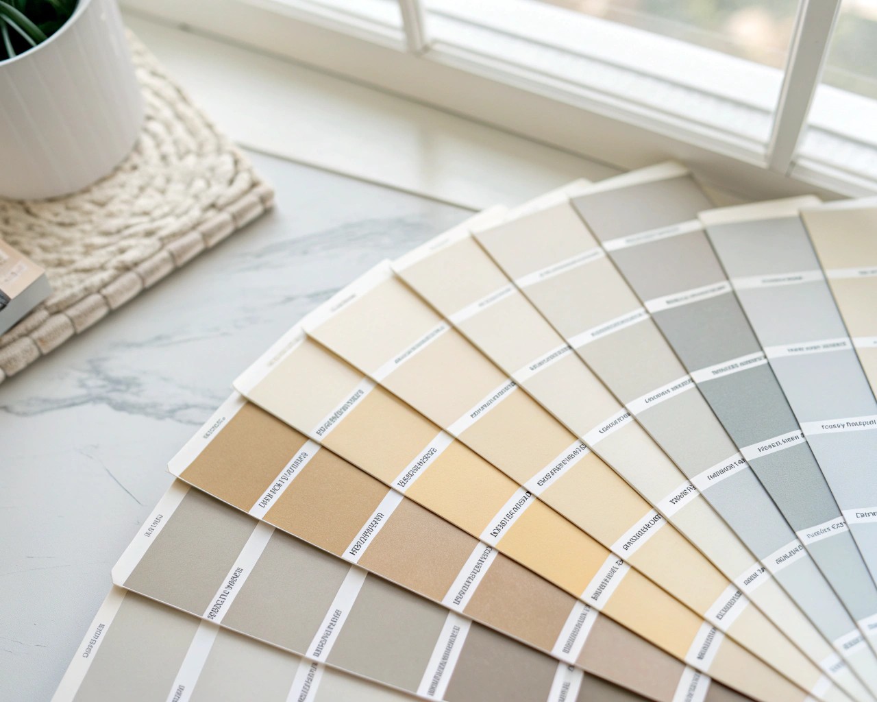
Neutral colors represent far more than the absence of bold hues. These sophisticated shades—spanning whites, beiges, grays, taupes, and greiges—form the foundational language of calm interiors. The term “neutral” encompasses a spectrum that includes pure colors (fully saturated black, white, brown, and gray without underlying hues) as well as complex neutrals that carry subtle undertones.
The beauty of neutrals lies in their psychological impact. Color psychology research confirms that soft, muted tones like sandy beige, chalky white, misty gray, and subtle greige help us feel more grounded, centered, and calm. These colors reduce visual clutter and create emotional clarity, establishing what designers call a “breathable backdrop” that allows both the eye and mind to rest.
Contemporary neutral palettes have evolved beyond the stark grays that dominated recent decades. The movement toward warmer, more organic neutrals reflects our collective desire for spaces that feel nurturing rather than clinical. Stone-inspired colors, mushroom tones, and earthy beiges now lead the conversation, offering depth without overwhelming the senses.
The Science Behind Calm: Light Reflectance Value
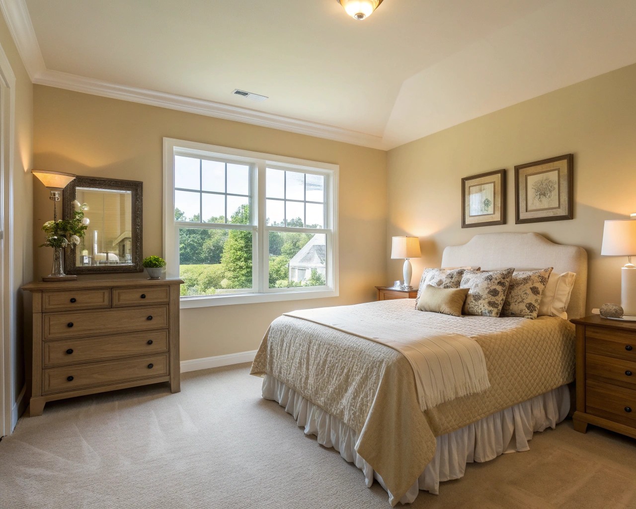
Understanding Light Reflectance Value (LRV) gives you precise control over how light or dark your chosen neutral will appear in your actual space. LRV measures the percentage of light a paint color reflects on a scale from 0 (pure black, absorbing nearly all light) to 100 (pure white, reflecting maximum light).
This number becomes your most reliable tool for predicting how a color will perform throughout the day. A neutral with an LRV of 83, like Benjamin Moore White Dove, bounces substantial light around a room, creating brightness even in corners with reduced natural light. Conversely, a color with an LRV of 48, such as Benjamin Moore Stone Hearth, provides more visual weight and creates a more intimate atmosphere.
LRV Ranges and Their Applications
| LRV Range | Classification | Best Applications | Visual Effect |
|---|---|---|---|
| 0-20 | Dark Depth | Accent walls, cabinetry in well-lit spaces | Dramatic, cocooning, intimate |
| 21-45 | Medium Depth | Living rooms, dining areas, exteriors | Grounded, warm, sophisticated |
| 46-60 | Light-Medium | Versatile for most rooms | Balanced, adaptable, neither too light nor dark |
| 61-75 | Light Depth | Bedrooms, kitchens, open floor plans | Airy, fresh, spacious feeling |
| 76-100 | Off-White to White | Small spaces, trim, ceilings | Bright, expansive, clean |
The crucial insight: natural light won’t change a color’s inherent LRV, but it dramatically affects how much of that reflective potential you can actually see. A color with an LRV of 72 in a room flooded with southern light may appear almost as bright as a color with an LRV of 77, while that same LRV 72 color in a dim north-facing room may read more like an LRV of 60.
Warm vs Cool Neutrals: Temperature Matters
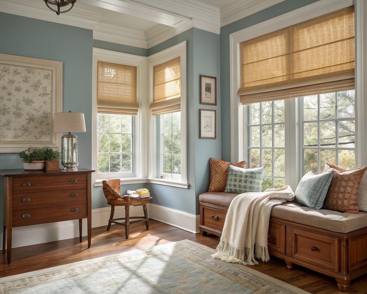
The temperature of your neutrals profoundly influences how a space feels. Warm neutrals—those with underlying hints of yellow, red, brown, or beige—create cozy, inviting environments that feel psychologically comforting. Cool neutrals—carrying undertones of blue, gray, or green—establish clean, modern spaces with a sense of calm clarity.
Warm tones tend to have an energetic, enveloping quality that makes rooms feel intimate and welcoming, particularly effective in north-facing rooms where natural light carries a cooler cast. They stimulate sociability, making them ideal for living rooms, dining areas, and other gathering spaces where you want people to feel comfortable lingering.
Cool tones, by contrast, possess an inherently calming, contemplative character. They work beautifully in private spaces designed for relaxation and rest—bedrooms, bathrooms, studies—where you seek tranquility rather than stimulation. In south-facing rooms bathed in warm afternoon light, cool neutrals prevent spaces from feeling overheated or oppressive.
The sophisticated approach involves understanding that the 80/20 rule creates dynamic tension while maintaining cohesion. Establish your dominant temperature (80%) through walls and major furnishings, then introduce the opposite temperature (20%) through accents, textiles, or smaller furniture pieces. This creates visual interest without discord—like a warm beige room elevated by soft gray-blue pillows, or a cool gray space warmed by cognac leather seating and natural wood elements.
Essential Neutral Color Families
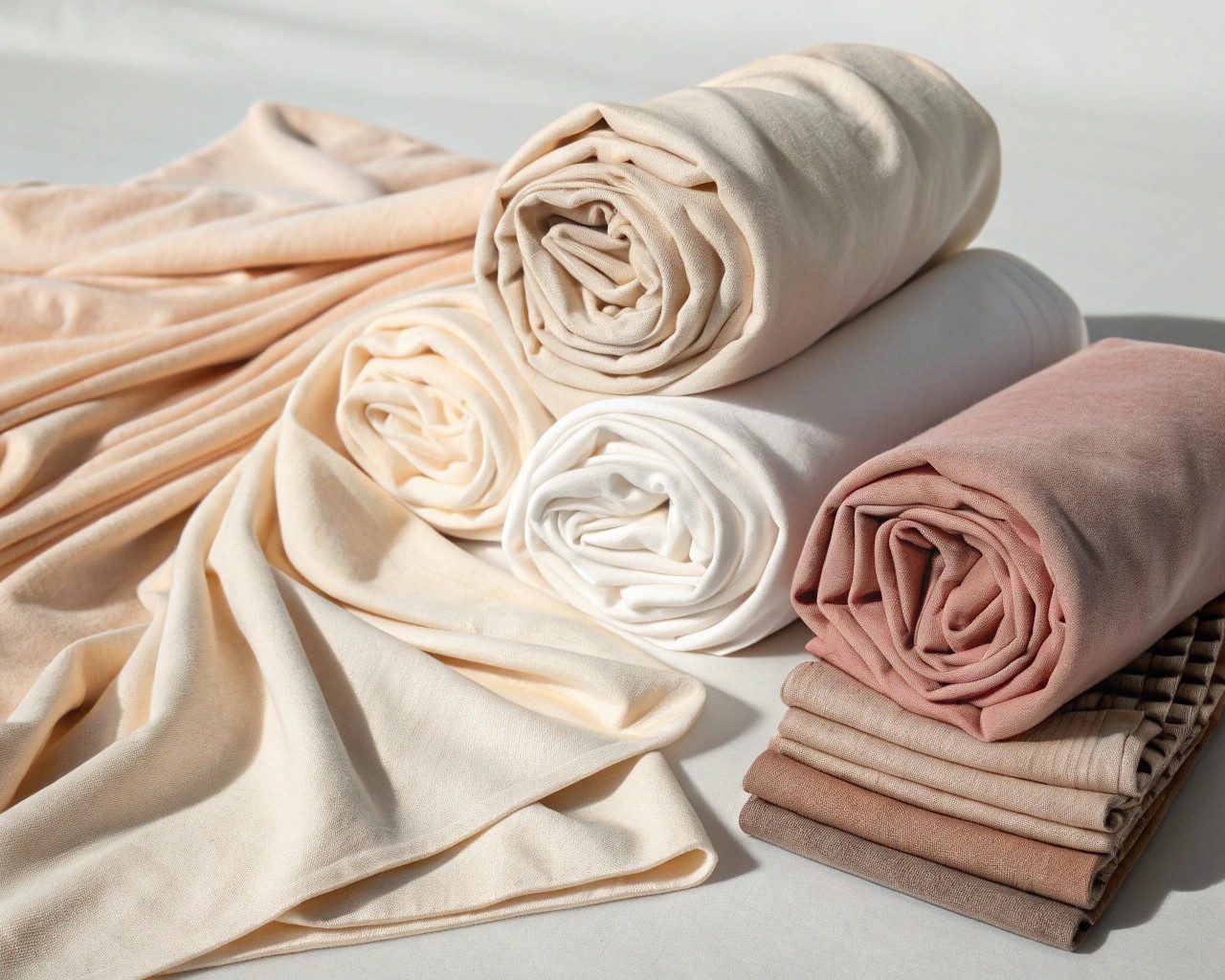
Whites and Off-Whites (LRV 75-95)
True calm begins with choosing whites that possess just enough warmth to feel welcoming rather than sterile. Pure white can feel cold and institutional, particularly in spaces with limited natural light. Off-whites with subtle cream, beige, or warm gray undertones provide the brightness you want while maintaining an inviting atmosphere.
Sherwin Williams Alabaster, Aesthetic White, and Shoji White represent the modern warm white family—clean enough to feel fresh but grounded with enough warmth to prevent that clinical feeling. Benjamin Moore White Dove and Swiss Coffee exemplify versatile off-whites that adapt beautifully to different lighting conditions, reading slightly warmer in northern light and crisper in southern exposures.
Beiges and Warm Neutrals (LRV 45-70)
Beige has returned to prominence, but today’s iterations differ significantly from the yellowed beiges of decades past. Contemporary beige neutrals feature creamy brown undertones with subtle hints of gray, creating what designers call “modern beige”—sophisticated colors that feel organic without appearing dated.
Sherwin Williams Accessible Beige (LRV 58) and Natural Tan (LRV 53) provide excellent starting points for warm neutral schemes. Benjamin Moore Muslin, with its subtle peach undertone that disappears in natural light, and Edgecomb Gray (a warm greige that works both as warm or cool depending on surroundings) demonstrate the versatility of this family.
Greiges: The Perfect Middle Ground (LRV 40-75)
Greige—the sophisticated marriage of gray and beige—offers unparalleled versatility. These balanced neutrals work with both warm and cool elements, making them ideal for open floor plans where you need one color to flow through spaces with varying natural light.
The key distinction: greiges always maintain warmth and typically carry subtle green undertones. Benjamin Moore Revere Pewter (LRV 55) stands as the archetypal greige, shifting between warm and cool depending on lighting conditions—a chameleon quality that makes it enduringly popular. Sherwin Williams Agreeable Gray (LRV 60), despite its name, falls into the greige family with minimal allegiance to either gray or beige, making it remarkably flexible.
Taupes: Sophisticated Depth (LRV 35-65)
Taupe neutrals sit between gray and beige but lean into violet-pink undertones that distinguish them from greiges. These more complex neutrals bring understated elegance and work particularly well in traditional homes or spaces where you want subtle warmth without obvious yellow or beige tones.
Sherwin Williams Shiitake (LRV 51) and Benjamin Moore Smokey Taupe (LRV 54.5) exemplify this family—warm enough to feel inviting yet sophisticated enough to pair with both traditional and contemporary furnishings.
Mushroom Tones: Earthy Modern Neutrals (LRV 28-58)
Mushroom paint colors represent the newest evolution in neutral palettes—deeper than soft greige, less pink than traditional taupe, with an organic, stone-inspired quality. These earthy neutrals combine beige, gray, and brown (sometimes with subtle green undertones) to create colors that feel grounded and natural.
Particularly effective on cabinetry and as accent walls, mushroom tones like Sherwin Williams Mushroom (LRV 57) and Loggia (LRV 48) add visual interest without reading as “colored” walls. They pair beautifully with warmer wood tones, granite countertops, and other natural materials that might clash with cooler grays.
Building Your Palette Room by Room
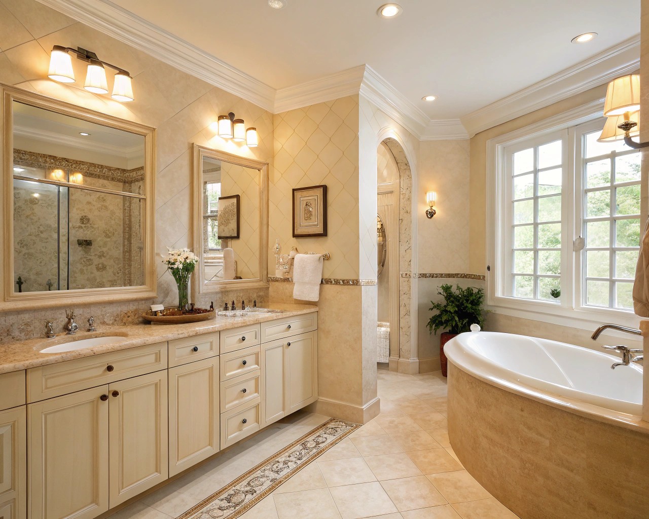
Living Spaces: Layered Neutrals for Comfort
Living rooms and family spaces benefit from light-to-medium neutrals (LRV 55-70) that create an airy backdrop while maintaining enough depth to feel grounded. In these high-traffic, multipurpose areas, I’ve found that slightly warmer neutrals in the 60-65 LRV range provide the most versatility—bright enough to feel spacious yet substantial enough that they don’t wash out in evening artificial light.
Consider establishing your base wall color, then introduce contrast through architectural elements. Painting trim in a crisper white (LRV 85+) while keeping walls at LRV 60-65 creates subtle definition that adds sophistication without jarring transitions. Alternatively, embrace color-drenching—painting walls, trim, and ceiling the same neutral—for a contemporary, enveloping effect that makes rooms feel larger and more cohesive.
The key to preventing living spaces from feeling flat: introduce varied tones of your base neutral throughout the room. If walls read as an LRV of 65, incorporate furnishings at LRV 50 (medium-toned natural wood) and LRV 75 (cream upholstery), with touches at both darker (black metal frames at LRV 10) and lighter (white ceramic at LRV 90) extremes. This tonal layering creates dimension within your monochromatic scheme.
Bedrooms: Serene Sanctuaries
Bedrooms call for colors at the lighter end of the neutral spectrum (LRV 60-75) to promote the psychological relaxation essential for restful sleep. Soft, barely-there neutrals like Sherwin Williams Frosty White (which shifts between blue, green, and gray depending on natural light) or Benjamin Moore Sea Pearl create the spa-like atmosphere many homeowners seek.
The bedroom offers unique freedom to explore either warm or cool neutrals based solely on personal preference, since you control both the time of use (primarily evening) and lighting conditions. If you find cool grays calming and modern, embrace them here—the evening artificial light you’ll use most often will add enough warmth to prevent coldness. Conversely, if warm beiges help you unwind, north-facing bedrooms provide the perfect canvas for these tones.
Kitchens: Balancing Function and Warmth
Kitchen neutrals must balance practical considerations—showing less wear, complementing countertop materials, working with existing cabinetry—while maintaining warmth that makes the heart of the home feel inviting. Wall colors in the LRV 65-75 range keep kitchens feeling bright and clean, essential for food preparation areas.
Warm neutral wall colors pair beautifully with white or off-white cabinetry, while mushroom-toned cabinets provide a sophisticated alternative to all-white kitchens without feeling heavy. Sherwin Williams Dover White or Benjamin Moore Revere Pewter on walls, combined with Alabaster or White Dove trim, creates the warm, layered neutral kitchen that feels both timeless and current.
Bathrooms: Preventing Clinical Coldness
Bathrooms present unique challenges due to their abundance of hard, reflective surfaces and typically smaller dimensions. While practical considerations might suggest cool, clean whites, these can easily tip into feeling sterile. Instead, opt for warm off-whites or soft beiges with LRVs of 70-80 that maintain brightness while adding subtle warmth.
Layer warm, natural materials—wood vanities, woven baskets, linen textiles—against your neutral backdrop to counteract the inherent coolness of tile, porcelain, and chrome. Even in predominantly white bathrooms, introducing warm brass fixtures or wooden accents transforms the temperature enough to prevent that institutional feeling.
The Power of Undertones: The Hidden Architecture
Undertones represent the subtle colors “hiding under” the main color you see—and they can either create incredible harmony or complete chaos in your space. Every neutral, no matter how seemingly simple, carries an undertone that becomes more apparent as lighting conditions change throughout the day.
Warm neutrals typically reveal yellow, peach, pink, or brown undertones. These emerge most obviously in direct sunlight or under warm (2700-3000K) artificial lighting. Cool neutrals show blue, gray, green, or violet undertones, which become more pronounced in northern light or under cooler (4000K+) LED bulbs.
The most common mistake in neutral palettes: failing to assess undertones before committing to multiple colors. A “gray” with blue undertones will clash with a “beige” carrying yellow undertones, creating visual discord that’s difficult to diagnose but impossible to ignore once you understand the cause. This explains why some rooms feel perpetually “off” despite using coordinating neutrals from the same paint deck.
Practical Undertone Assessment
The reliable method for identifying undertones involves comparison rather than isolation. Place your paint sample next to pure white paper—the undertone becomes immediately visible in contrast. Test this assessment at different times of day, as undertones shift with changing natural light.
North-facing rooms receive cool, flat light with blue casts that intensify cool undertones and can make even warm neutrals appear drab. These spaces desperately need warm neutrals (with yellow, peach, or brown undertones) to counteract the inherent coolness of the light. South-facing rooms bathe in warm, golden light that intensifies warm undertones—here, you can either embrace that warmth or balance it with cooler neutrals.
East-facing rooms start cool and brighten throughout morning, while west-facing rooms remain dim until afternoon when they flood with warm light. These transitional spaces work best with balanced neutrals (greiges, warm grays) that adapt gracefully to changing conditions rather than fighting against them.
Layering Texture and Materials: Bringing Neutrals to Life
In neutral interiors, texture becomes the vehicle for visual interest that color provides in more vibrant schemes. Without textural variation, even the most carefully chosen neutral palette falls flat, appearing monotonous rather than serene.
The principle involves combining materials with contrasting tactile qualities within your neutral color family. Smooth plaster walls against nubby linen upholstery. Sleek marble countertops beside rough-hewn wooden beams. Glossy ceramic vessels on matte woven trays. Each material catches and reflects light differently, creating subtle variations in how your neutral palette reads throughout the space.
Essential Textural Elements for Neutral Spaces
Natural Wood: Warm wood tones—whether honey oak, walnut, or bleached pine—add organic warmth that prevents neutral rooms from feeling cold or institutional. Wood introduces subtle color variation (golden, amber, or gray-brown tones) while maintaining neutral cohesion. Keep wood tones within a similar temperature family (all warm or all cool) to prevent discord.
Linen and Natural Textiles: Linen’s inherent texture and subtle surface irregularities create visual interest even in solid neutral tones. The fabric’s natural breathability and soft drape bring an effortless, lived-in quality that polished materials can’t achieve. Layer linen curtains, cushions, throws, and upholstery in varying shades of your neutral family—from cream to oatmeal to warm gray.
Stone and Mineral Elements: Stone introduces subtle color variations within neutral palettes—the veining in marble, the mottled texture of limestone, the speckled quality of granite. These materials ground spaces with their weight and permanence while contributing earthy neutrals that feel connected to nature.
Woven and Basketry: Jute, sisal, rattan, and seagrass bring tactile warmth and visual texture without introducing color. Woven rugs anchor spaces, while rattan furniture and wicker accessories add dimensional interest. These materials excel at warming up spaces that risk feeling too sleek or minimal.
Metal Finishes: Brass, bronze, and warm metallics add subtle gleam without breaking the neutral palette. These warmer metals complement beige and warm gray neutrals beautifully, adding just enough shine to catch light without competing for attention. In cooler neutral schemes, brushed nickel, chrome, or blackened steel maintain temperature consistency.
The sophisticated approach layers at least four different textures within each room. A neutral living room might combine smooth painted walls (matte finish), a textured linen sofa, a nubby wool rug, smooth wooden side tables, and woven baskets—all within a cohesive neutral palette but each contributing distinct tactile interest.
Common Mistakes to Avoid
Ignoring the Impact of Existing Fixed Elements
Your home’s permanent features—flooring, countertops, tile, cabinetry—carry their own undertones that must work with your chosen neutral palette. Honey oak flooring has warm yellow undertones that clash with cool gray walls, while gray-toned tile looks jarring against warm peachy beiges.
Before selecting wall colors, assess the undertones in your floors, countertops, and any cabinetry you’re keeping. Match temperature families: warm floors with warm neutrals, cool floors with cool neutrals. If you have mixed temperatures in fixed elements (warm wood floors with cool granite counters), choose balanced neutrals like greiges that can bridge both temperatures.
Using Too Many Similar Tones Without Contrast
Neutral doesn’t mean monotonous, yet many neutral rooms fail because they lack tonal contrast. A room where walls, furniture, flooring, and textiles all sit at the same LRV (say, everything clustered around 60-65) appears flat and one-dimensional rather than calm.
The remedy: deliberately vary your LRV values throughout the space. If walls sit at LRV 65, introduce elements at LRV 40-50 (medium wood tones, mushroom upholstery), LRV 75-85 (cream textiles, light wood), and accent points at LRV 10-20 (black window frames, dark metal hardware) and LRV 90+ (white trim, bright textiles). This creates visual hierarchy and dimension while maintaining neutral cohesion.
Neglecting Warm Lighting in Cool Neutral Spaces
Cool gray and blue-toned neutrals can veer into feeling cold and unwelcoming when paired with cool-temperature (4000K+) LED lighting. The cumulative effect—cool wall color plus cool light—creates a clinical, institutional atmosphere that undermines the calm you’re seeking.
The solution involves selecting warm-temperature (2700-3000K) LED bulbs or incandescent-equivalent lighting that adds yellow-toned warmth to balance cool wall colors. This lighting choice particularly matters in evening hours when you rely entirely on artificial light. Layer multiple light sources at eye level (table lamps, floor lamps) rather than depending solely on overhead fixtures, which creates warmer, more inviting pools of light.
Skipping the Sampling Process
Paint colors look dramatically different on your actual walls compared to tiny paint chips or online swatches. Variables including your specific lighting, surrounding colors, and even your wall texture affect how neutrals read in your space.
The non-negotiable process: obtain large samples (at minimum 12″ x 12″, preferably peel-and-stick samples or paint on poster board) and observe them in your space for 24-48 hours. Watch how the color shifts from morning to evening, under natural and artificial light, on different walls receiving varying light exposures. A neutral that appears perfect at noon may look dingy at dusk or washed out in morning light.
Paint samples on different walls within the same room, as light quality varies significantly even within one space. Place samples away from your current wall color if possible (paint on white poster board) since existing colors influence perception.
Creating an All-Neutral Palette Without Strategic Color Accents
While neutral palettes provide calm foundations, rooms entirely devoid of any color accent can feel bland rather than serene. The solution isn’t reintroducing bold primary colors, but rather thoughtfully selected muted accent tones that enhance rather than compete with your neutral scheme.
Consider organic accent colors that function almost as neutrals themselves: soft sage green, muted terracotta, dusty blue, warm ochre, or gentle blush. Use these sparingly (following the 60-30-10 rule: 60% dominant neutral, 30% secondary neutral, 10% accent color) through textiles, artwork, pottery, or plants. These subtle color moments add life and prevent the sterile feeling that can plague all-neutral spaces.
Testing and Implementing Your Palette
The Strategic Sampling Sequence
Begin by selecting 3-4 neutral candidates within your target LRV range and temperature family. Order large peel-and-stick samples or paint samples on 2′ x 2′ white poster board using two coats for accurate color representation.
Position samples on at least two different walls in your space—one receiving the most natural light and one in the dimmest area. Include a sample on any wall you consider an accent or focal point wall. Live with these samples for a full day-night cycle, observing them at different times: early morning, midday, afternoon, and evening under artificial light.
Photograph your samples at different times of day—cameras often reveal undertones the eye initially misses. Notice which neutral remains appealing across all lighting conditions rather than simply looking good in one particular light.
Building a Cohesive Multi-Room Palette
For homes with open floor plans or visible sightlines between rooms, establishing a cohesive neutral palette prevents jarring transitions while allowing subtle variation. The approach involves selecting neutrals that share undertones and temperature but vary in depth (LRV).
One effective method: choose three neutrals within the same color family but at different LRVs—perhaps LRV 75 for main living areas, LRV 65 for bedrooms, and LRV 55 for accent walls or cabinetry. All three share warmth and undertones but create gentle differentiation that defines spaces without harsh boundaries.
Alternatively, select one neutral as your throughout color (LRV 60-70) for all walls and flow spaces, then vary accent colors, trim treatments, and textiles by room. This creates the most seamless, calming flow—particularly effective in smaller homes where visual continuity makes spaces feel larger.
Integrating the 80/20 Temperature Rule
Once you’ve established your dominant neutral temperature, deliberately introduce the opposite temperature in roughly 20% of your materials and accents. If your walls, major furniture, and flooring all lean warm, introduce cool-toned elements through: gray-blue pillows, brushed nickel hardware, cool-toned artwork, or a single cool-gray accent chair.
This creates what designers call “temperature tension”—the dynamic balance that prevents rooms from feeling flat or one-note. The 20% opposite-temperature elements add visual interest and dimension without creating discord, similar to how a violin string tuned to perfect tension produces beautiful tone.
Living With and Refining Your Palette
Neutral palettes reveal their success gradually. Unlike bold colors that make immediate statements, neutrals work subtly, their success measured in how the space makes you feel rather than how it first appears. Give your neutral palette at least two weeks before making adjustments—you need time to experience the space in various moods, times of day, and seasons.
If your neutral feels flat after this adjustment period, the issue likely involves insufficient tonal contrast or texture rather than wrong color choice. Add deeper-toned elements (LRV 20-40 range), layer additional textures, or introduce small color accents before abandoning your palette entirely.
If your neutral reads as the wrong temperature (too cool when you wanted warm, or vice versa), lighting adjustments may solve the issue before repainting. Switch to warmer bulbs, add table lamps, or introduce warm-toned textiles. Sometimes the right lighting transforms a borderline neutral into exactly what you envisioned.
The beauty of well-executed neutral palettes lies in their capacity to evolve with you. Unlike trend-driven color schemes, neutrals provide an enduring foundation that accommodates changing tastes through textiles, accessories, and accents rather than requiring complete redesigns. This adaptability—combined with their inherent capacity to create calm, cohesive spaces—explains why neutrals remain the most enduring choice for interiors designed to nurture rather than stimulate.

